This is page 27. Its the only page I'm doing today for reasons of time. But I've done something with it I don't commonly do when I draw comics, although it does some up from time to time.
I've moved dialogue.
Below, as JH wrote it:
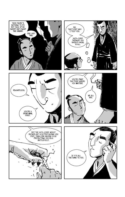
It works just fine. In reading this on a single page one tends to move quickly from panel to panel, but screen turns are page turns and even when a screen is a single panel, the jump to the next one is bigger. So you have to reassess what you put in each panel/screen.
So for this first screen, I've moved the word "No." from the second panel to the first. Thus, the first screen becomes not simply a statement of intent by Okita, but an interaction and a conflict. Much more tension encapsulated on a single panel.
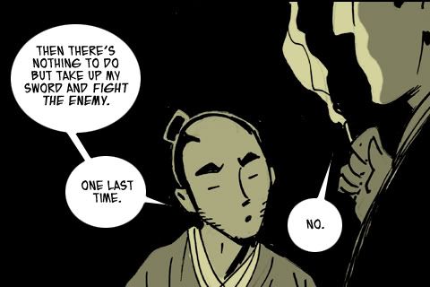
Screen 2 now becomes the explanation, for the "No." And losing the "No." doesn't really hurt it.
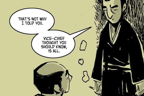
And the next screen shows two related panels as Saitoh shows how icy his veins run, and how willing he is to be cruel to Okita. If this were originally designed for iPhone, I would propose that this should be a single image.
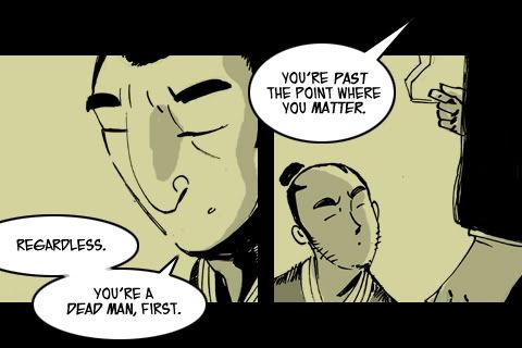
I make another text move here. "We all are." (Past the point where we matter.) First off, this is why JH is a writer to watch. With this line he has turned Saitoh's casual cruelty towards Okita into a self-indictment. Nice subtle stuff, and moving it to the panel where Saitoh puts out his cigarette lends resonance. I'd added fffssss sound effect to make sure that my crude drawing would read as a snuffing.
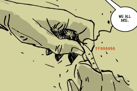
So the next bit of dialogue moves to the final panel. Admittedly, it does soften the impact of a final single line from Saitoh, but I think that cold glare of his has strength enough, and it can't all be cuts to final pithy comments.
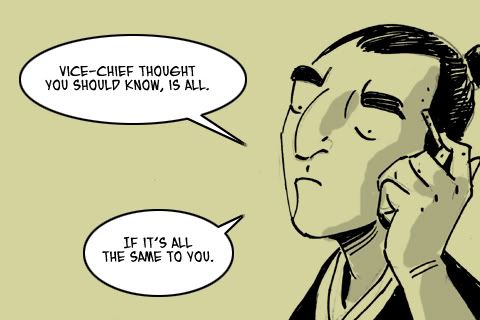
I'm learning a lot as I do this. What works on a page of comics doesn't always prove to be the best approach for this format. Some of my choices are simply making the best of it. I'm excited now about the idea of writing specifically for this format and exploring the way it changes how you place and pace things.
No comments:
Post a Comment