I got Stieg Larsson's The Girl with the Dragon Tattoo as a Father's Day gift. I had seen the Millenium books at work, but had never really heard anything about them prior to that. They're bestsellers, which is probably why I hadn't heard of them. I don't keep track of the Man-Booker Prize or the National Book Awards either.
I had some other reading to do first, and by the time I got to it, I was a little burnt out. I read the prologue and thought it was engaging enough, but set the book aside for a few days. I finally got going on it and thought, well, that it moved slowly, and Larsson spent a lot of time describing the backstory of each character he introduced. Y'know the old "show, don't tell" dictum? Well, he tells. And tells. And tells. In other words, I didn't think the writing, as such, was all that great.
But the story kept me in it, I'll give it that. It develops slowly. The big action climax occurs more than 100 pages before the story is over. Larsson spends the rest of it tieing up all the other loose ends. Nevertheless, by the end of it, I wanted to read the other two books. I liked the characters and world he created.
I picked up The Girl Who Played with Fire and read through that fairly quickly. I had been told that it was "not as good as the first." No, I suppose not. This book was also slow to develop, told more than showed, the villains were cartoonish, it was told from many more points of view than that of the two protagonists, who never even spent any time together until the final pages, and almost never even communicated with each other!
And by the end, it was clear that this was really the first half of a novel. Oh, it resolved the main dilemma well enough, but left plenty of loose threads waiting to be picked up in the next novel The Girl Who kicked the Hornet's Nest, which, judging by the preview at the back, picks up directly from the end of the second book.
It looks to me like Larsson had one book in mind, and by the time he finished, was so hooked in by his own characters that he wanted to write more, and plotted out a longer tale based on backstory he had developed but not included in the first book. there are a few clues... but they may have been added in after he finished the trio. They were all submitted for publication at once after all. I've no doubt that Larsson, had he lived, would have continued the series, especially given how popular its become.
I haven't read the third book yet. Its still in hardcover and I'll probably wait for the paperback.
The English language titles are more colorful than the Swedish ones. The first was called Men Who Hate Women, I believe, and it certainly spells out one of the themes of the book and gives a taste of the somewhat heavy handed approach Larsson takes to all things. You won't mistake his intentions.
Will I go see the movies? The Swedish versions might be interesting and boring at once. An American version will star Daniel Craig as Michael Blomkvist, which had me groaning. I like Craig well enough (unlike C who can't stand him) but I think he's too buff and hyper-masculine for Blomkvist, who reads to me like more of a regular guy, reasonable fit and with a gift for attracting woman. The more it sits with me, the more I think that Craig can pull it off though. He's a pretty good actor I think, just too hunky.
As of now,they apparently are still testing actresses for Lisbeth Salander. I saw Ellen Page in Inception yesterday and thought that she would be a fine choice. She's very small, pretty but not too pretty, and still looks to be about 15 years old, although at 23, she's the same age as Salander in the first book. Her persona seems rather low key and even dry, which suits Salander, and I read that she was considered but is not on the final list. they will probably settle on someone who is glum and pouty.
I can't believe they considered Scarlett Johansson at any point, but it was on the Interweb, so it must be true.
Saturday, July 31, 2010
Saturday, July 24, 2010
To the iPhone, Okita! 14
As I moved towards the end of this, the scenes started to have more action and less dialogue, so I have combined more panels. Here is a scene of quiet action
And for your amusement, more action.
And the final panel, which is the second to the last screen. 169 screens, including a Title Page, Indicia and AfterWord. Now we'll have some editing to do, and then submit the art.
And for your amusement, more action.
And the final panel, which is the second to the last screen. 169 screens, including a Title Page, Indicia and AfterWord. Now we'll have some editing to do, and then submit the art.
Thursday, July 22, 2010
To the iPhone, Okita! 13
I was pointed to this comic as one designed for the iPhone.
https://comics.comixology.com/#/view/561/Box-13-1
My response below:
An interesting comic, thanks for pointing to this. It features attractive art, and like me, they are using a limited color palette.
But it doesn’t look like it was designed for the iPhone format in the sense that I mean, even if they always intended to take it there first. It looks like it was scanned from a printed comic: there are gutter shadows evident. But even if these are some other production artifact, and the book went to Comixology before print, it was clearly (and well) designed with the printed page in mind.
One of the things I’ve noticed about the Comixology and Panelfly apps is that they allow for panning and dollying of a comics page to come in close on panels. This isn’t new. People have been taking a film or video camera to a comics page for along time and doing exactly these things to “read” the page. I did it myself for a video class I took at UCLA back in 1973. (The portable cameras weighed 50 lbs.) I panned across a very large comics page I had drawn, amply demonstrating that not only did I fail to fully grasp the limitations of comics, but I didn’t understand video very well either.
The ability to control the pace and direction of the reading experience no doubt makes it all much more immersive than watching a tape. But these are also very clearly features designed to accommodate the fact that the screen size is tiny and incapable of presenting a full page in a readable condition at once. These are necessary features if you are bringing your print comic to these devices. I have no idea if Arrow’s app allows for this. From the few examples I’ve seen, it appears to be a slide show approach and that is what I’m doing, placing 1 to 3 (in a few cases 4)panels to a screen shot.
Young readers with open minds and hearts may take to these pan and dolly features like flies to shi-- uh, sugar and I’ve got a canalized old brain, but it seems clear to me that these apps are designed to bring an old medium to a new venue and creators are not considering this as an entirely new medium.
One example:
I’ve encountered this with Okita. My panels are drawn at different sizes for the purposes of matching a story to the page. The marks that I use in my drawings are made with a narrow selection of tools and consequently have a certain scale and degree of detail. When these different sized panels are scaled to fit the rigid size of the screen, they are enlarged or shrunk to different degrees. This is complicated by a variety of techniques I’ve used to add to or subtract from the original art.
But the result is that the quality of the marks can be crude or quite subtle depending on how the original is scaled. I make no judgment here of the relative value of each. I often like crude marks for their energy, but the point here is that these qualities are controlled by the need to fit different drawings into a single slot, and not by the design intent of the artist.If you draw with the intent that your art will appear as a specific size/resolution, then you can get the specific results you want-- or at least a consistent line quality.
Another:
I’ve indicated this earlier. If you address each screen shot as a page turn then you begin to think in terms of 1 to 3-4 panel units and how you make each of these engaging, or how you express an idea in a unit of this size. Just as the old adventure comics of the newspapers moved at a different pace then a comic book does (Terry and the Pirates is a great example), so an iPhone comic suggests a different kind of pacing, and that is very much what I am looking for in my decisions about how to cut up the Okita pages.
Sometimes the results are not fully satisfactory, but then it wasn’t designed for this format, and that’s my point.
Tuesday, July 20, 2010
To the iPhone, Okita! 12
More thoughts on how to make an iPhone comic.
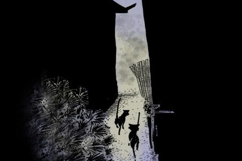
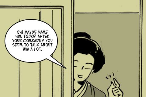
This is page 27. Its the only page I'm doing today for reasons of time. But I've done something with it I don't commonly do when I draw comics, although it does some up from time to time.
I've moved dialogue.
Below, as JH wrote it:
It works just fine. In reading this on a single page one tends to move quickly from panel to panel, but screen turns are page turns and even when a screen is a single panel, the jump to the next one is bigger. So you have to reassess what you put in each panel/screen.
So for this first screen, I've moved the word "No." from the second panel to the first. Thus, the first screen becomes not simply a statement of intent by Okita, but an interaction and a conflict. Much more tension encapsulated on a single panel.
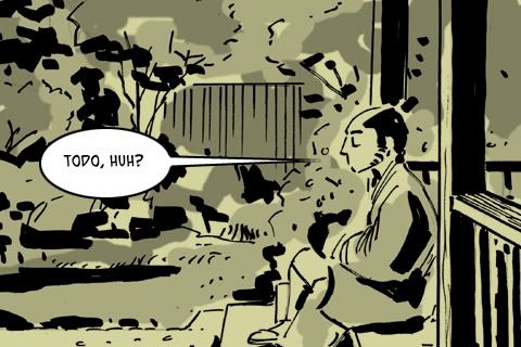
Screen 2 now becomes the explanation, for the "No." And losing the "No." doesn't really hurt it.
And the next screen shows two related panels as Saitoh shows how icy his veins run, and how willing he is to be cruel to Okita. If this were originally designed for iPhone, I would propose that this should be a single image.
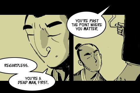
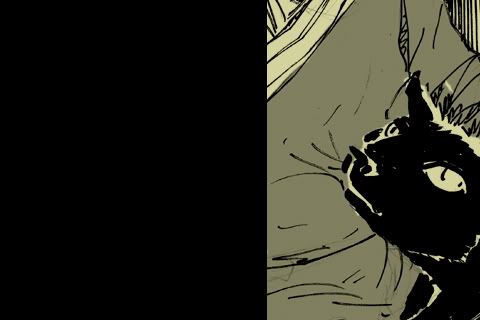
I make another text move here. "We all are." (Past the point where we matter.) First off, this is why JH is a writer to watch. With this line he has turned Saitoh's casual cruelty towards Okita into a self-indictment. Nice subtle stuff, and moving it to the panel where Saitoh puts out his cigarette lends resonance. I'd added fffssss sound effect to make sure that my crude drawing would read as a snuffing.
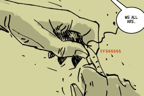
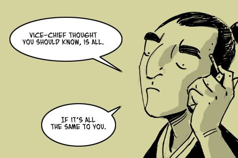
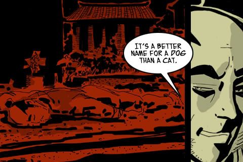
So the next bit of dialogue moves to the final panel. Admittedly, it does soften the impact of a final single line from Saitoh, but I think that cold glare of his has strength enough, and it can't all be cuts to final pithy comments.
I'm learning a lot as I do this. What works on a page of comics doesn't always prove to be the best approach for this format. Some of my choices are simply making the best of it. I'm excited now about the idea of writing specifically for this format and exploring the way it changes how you place and pace things.
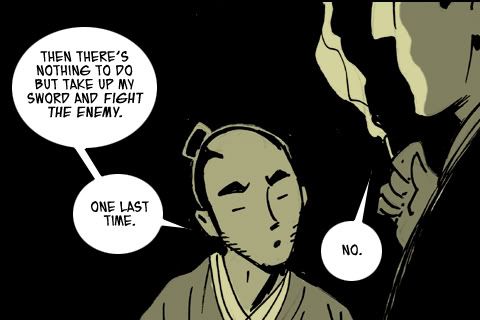
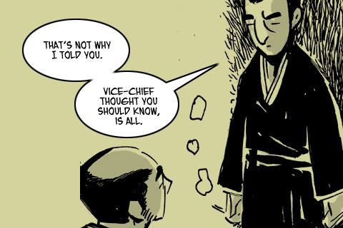
This is page 27. Its the only page I'm doing today for reasons of time. But I've done something with it I don't commonly do when I draw comics, although it does some up from time to time.
I've moved dialogue.
Below, as JH wrote it:
It works just fine. In reading this on a single page one tends to move quickly from panel to panel, but screen turns are page turns and even when a screen is a single panel, the jump to the next one is bigger. So you have to reassess what you put in each panel/screen.
So for this first screen, I've moved the word "No." from the second panel to the first. Thus, the first screen becomes not simply a statement of intent by Okita, but an interaction and a conflict. Much more tension encapsulated on a single panel.
Screen 2 now becomes the explanation, for the "No." And losing the "No." doesn't really hurt it.
And the next screen shows two related panels as Saitoh shows how icy his veins run, and how willing he is to be cruel to Okita. If this were originally designed for iPhone, I would propose that this should be a single image.
I make another text move here. "We all are." (Past the point where we matter.) First off, this is why JH is a writer to watch. With this line he has turned Saitoh's casual cruelty towards Okita into a self-indictment. Nice subtle stuff, and moving it to the panel where Saitoh puts out his cigarette lends resonance. I'd added fffssss sound effect to make sure that my crude drawing would read as a snuffing.
So the next bit of dialogue moves to the final panel. Admittedly, it does soften the impact of a final single line from Saitoh, but I think that cold glare of his has strength enough, and it can't all be cuts to final pithy comments.
I'm learning a lot as I do this. What works on a page of comics doesn't always prove to be the best approach for this format. Some of my choices are simply making the best of it. I'm excited now about the idea of writing specifically for this format and exploring the way it changes how you place and pace things.
Monday, July 19, 2010
To the iPhone, Okita! 11

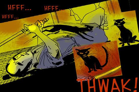
One of the cool things that happens is that I get to revisit images. In the original, this one didn't have the necessary energy. So I doubled the drawing and offset it a little, and now its more of a table pounding experience.

Sunday, July 18, 2010
To the iPhone, Okita! 09
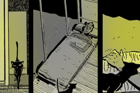
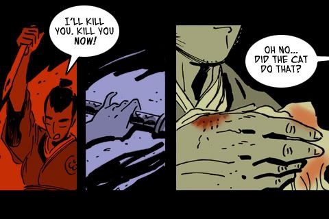
Page 16 from Okita and the Cat.
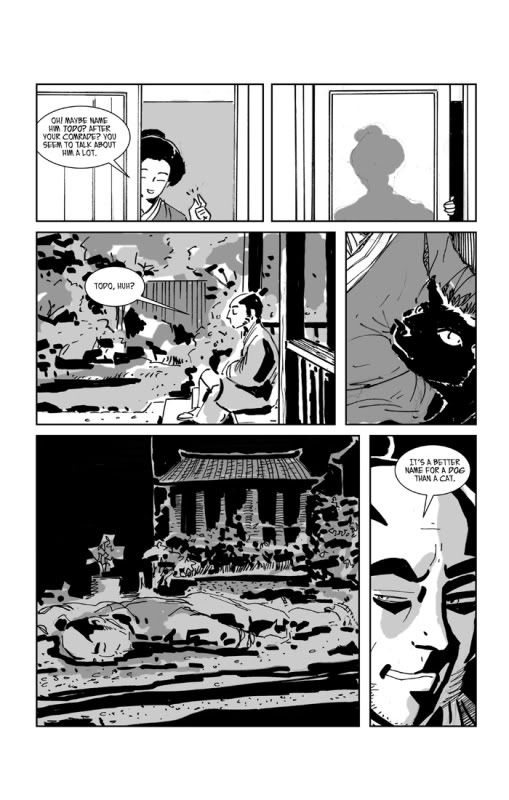
And this is what I've done with it.
This page is a good example of some of the approaches I've used to cut this story up. Six panels have become four screens. two simple took up the full screen and in the case of the first one, was enlarged slightly, and t in the case of the exterior shot, has been cropped. The close up of the cat was isolated as a reaction shot, and the two final panels were posted as one, because the head shot features Okita commenting on what has happened in the red panel.
I did something else here as well, which I hadn't expected i would do at all, but I eliminated a panel. the small panel of the Nurse closing the shoji screen. It works okay as a small part of a larger page, but isolating it as a single screen gives it too much importance, and there's too little drawing going on to make it interesting. I considered combining it with the first panel, but it still felt like an intrusion, and having the exterior shot follow the nurse's comment seemed clear enough to me.
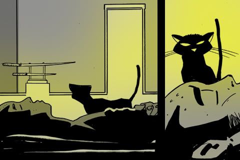
Note that the one red panel is a flashback. I have been using color partially symbolically, and partially geographically. that is, I use it to help clue the reader as to where you are in the story. Rec for Violence and the Emperor's loyalists. Blue for the Shinsengumi, and tan for the quieter scenes of Okita in his sick house.
From a later screen, you can see the three colors at once.
And this is what I've done with it.
This page is a good example of some of the approaches I've used to cut this story up. Six panels have become four screens. two simple took up the full screen and in the case of the first one, was enlarged slightly, and t in the case of the exterior shot, has been cropped. The close up of the cat was isolated as a reaction shot, and the two final panels were posted as one, because the head shot features Okita commenting on what has happened in the red panel.
I did something else here as well, which I hadn't expected i would do at all, but I eliminated a panel. the small panel of the Nurse closing the shoji screen. It works okay as a small part of a larger page, but isolating it as a single screen gives it too much importance, and there's too little drawing going on to make it interesting. I considered combining it with the first panel, but it still felt like an intrusion, and having the exterior shot follow the nurse's comment seemed clear enough to me.
Note that the one red panel is a flashback. I have been using color partially symbolically, and partially geographically. that is, I use it to help clue the reader as to where you are in the story. Rec for Violence and the Emperor's loyalists. Blue for the Shinsengumi, and tan for the quieter scenes of Okita in his sick house.
From a later screen, you can see the three colors at once.
Friday, July 16, 2010
To the iPhone, Okita! 08

JH sent me a tutorial on how he went about cutting BBB up that was helpful, but my approach is different. I created a template PSD file in Pshop @ 480x320 @ 72ppi. I then open up one of my original unflattened PSD files of the comic which is at 450ppi.
I flatten the linked art and graytone layers and then reduce the whole file to 100 or maybe 150 ppi (if it has some very small panels) and then cut out the piece of art I want and drag it to my template and save it out as a new file number (Okita_001).
I also drag over the appropriate text in un-rasterized form which allows me to re-size it @ 14pt in this case. I'm using Blambot's Eurocomic font. and then redraw the balloons.
Then I recolor on a layer beneath the art using simple colors and allwing the graytones to add some complexity. I save it out unflattened and then also a flattened JPG at the highest quality.
voila!
Thursday, July 15, 2010
To the iPhone, Okita! 07

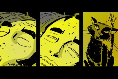
And top of the page last. Odd I think, but it worked out that the parts of the original illustration, which was literal enough, become a bit more metaphorical when parsed out like this.
You agree?

To the iPhone, Okita! 05

The Story begins.
I broke the first page up into three panels. This is one illustration chopped up into three. A most unusual approach, I think. Most of my iPhone pages show only one panel, although several show rows of two or three.
But this panel has parts that could be fruitfully broken out to illustrate each of the three captions, although that wasn't intended when in drew it. As witness by the fact that the panels appear out of order. That is they don't run top to bottom, or bottom to top, but are mixed up. See the first post below for reference.
Wednesday, July 14, 2010

To the iPhone, Okita! 03
Reposted form PnP.
***
The developer is Arrow Publications, a publisher of romance novels primarily, although they go broader then that as well.
http://www.arrowpub.com/
They are producing a line of romance "graphic novels" at this web site.
http://www.myromancestory.com/
I put "graphic novels" in quotes because they are talking about stories running 60-90 panels. They have a few samples there and its worth checking out. Now I'm not looking for snarky responses here. I think we will all look at the work presented and find it to be artistically tame.
Their audience is woman, they have a clear idea about what their audience wants to see. And they are looking for artists to do work for hire. I've no idea what they pay, or what the deal is. Okita doesn't exactly fit this profile and our deal is much like the creator ownership deals that most small comics publishers offer these days.
The art is not bad, although tame, and the dialogue is execrable, but this is potentially a huge market they are attempting to tap, and comics professionals with some real skill could make a real mark here provided that they were respectful of the conventions and preferences of this market.
To the iPhone, Okita! 02
I took my first post and started a thread at PanelandPixel reposting much of this material.
Got a response back noting that I betrayed little experience with comics on the iPhone. I acknowledge that I have none. And this was my response, re-posted here.
***
You're right that I've never seen a comic on an iPhone. Not sure who I know that I could borrow one from. There is an Apple store a block down from where I work, so maybe they could show me one. I'll google Comixology and see if they have any info.
Two things I'm thinking though.
1) I don't think I'd want to be doing turns on the phone to accommodate different panels directions. Maybe its comfortable for people who use them all the time, but it seems to me that it would pull you out of the story to have to change directions.
2) It seems to me that its a medium well suited to intimate stories. Just as the small screen size of television suggests more intimately told stories than cinema, so it would seem to me that the small screen of the iPhone would favor intimately told stories... which suits Okita well.
Now it may well be that the people who buy iPhones and comics over iPhones prefer slam bang action tales (and we do have some action) but the format suggests intimacy to me.
At any rate I expect to be actively posting to this thread over the coming days so stay tuned and chime in. Thanks for the suggestion!
To the iPhone, Okita! 01

So I have the contracts to bring Okita and the cat to iPhone as a $2.99 app, but this means i have some additional work to do. For readability, it will be necessary to present the comic at one, or perhaps two panels per screen shot. Each image will have to be 320x480 pixels per inch in jpeg format. Or 480x320 if we want to go with horizontal panels, as my partner recommends.
My art should read well at the smaller scale, but the text will have to be resized. It simply loses too much resolution to be readable, as you can see in the attached illustration, which is page one shot down to scale and trimmed a tick.
Okita was also drawn as a black and white book for economical print production. But color is essentially free in the digital world. yes there is increased file size, but with current technology it makes no real difference, and it seems a better deal to entice readers with color, so I'll have to provide some.
A co-worker of mine claimed that the comics she had seen on iPhone's were all so garish that they were difficult to read, so I will go with a very limited palette,both for that reason and because it'll be faster and easier.
The exciting thing for me really, is that is trimming my panels to fit the same size rectangular box, I'm going to have to re-appraise and rethink what I've drawn to make the comic work. It will beg some a very different beast. Page turns will mean something entirely different. In effect, this is a comic strip as slide show.
Wednesday, July 7, 2010
Okita and the Cat

It looks like we could be taking this to the iPhone. For now though we've added a cover.
Saturday, July 3, 2010
Summer update 02
Grinding a little bit on my Revit studies but consider it crucial if I'm going to be ready for a job when the job is ready for me. I like the program quite a bit, but working through a study book on my own gets tiresome.
I have some new thoughts on my novel idea that should add some layers of complexity to it.
Getting back into a drawing frame of mind. I need to do some nice complex finished drawings.
And simplify "my stuff".
I have some new thoughts on my novel idea that should add some layers of complexity to it.
Getting back into a drawing frame of mind. I need to do some nice complex finished drawings.
And simplify "my stuff".
Subscribe to:
Posts (Atom)