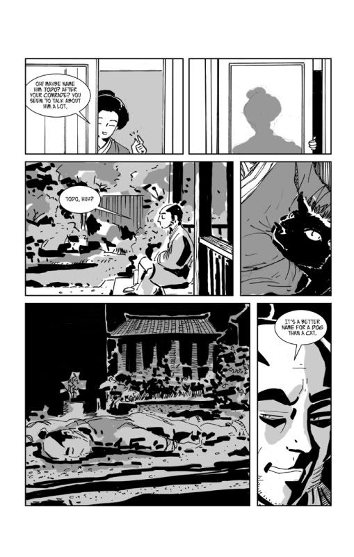
And this is what I've done with it.
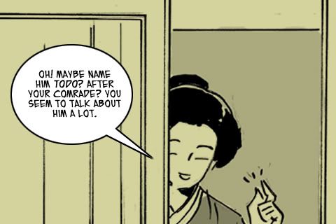
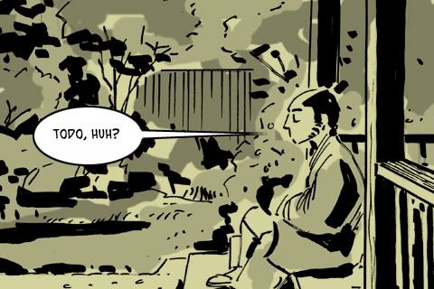
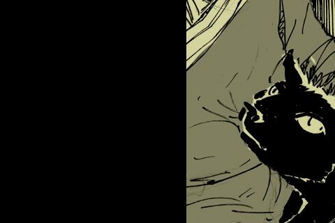
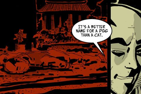
This page is a good example of some of the approaches I've used to cut this story up. Six panels have become four screens. two simple took up the full screen and in the case of the first one, was enlarged slightly, and t in the case of the exterior shot, has been cropped. The close up of the cat was isolated as a reaction shot, and the two final panels were posted as one, because the head shot features Okita commenting on what has happened in the red panel.
I did something else here as well, which I hadn't expected i would do at all, but I eliminated a panel. the small panel of the Nurse closing the shoji screen. It works okay as a small part of a larger page, but isolating it as a single screen gives it too much importance, and there's too little drawing going on to make it interesting. I considered combining it with the first panel, but it still felt like an intrusion, and having the exterior shot follow the nurse's comment seemed clear enough to me.
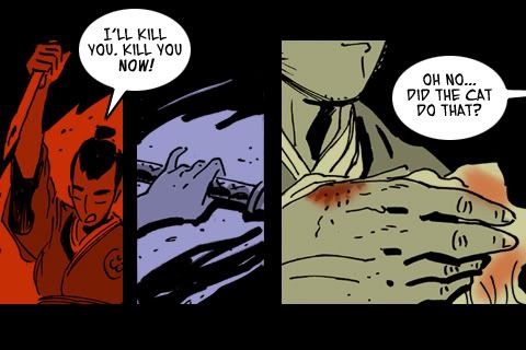
Note that the one red panel is a flashback. I have been using color partially symbolically, and partially geographically. that is, I use it to help clue the reader as to where you are in the story. Rec for Violence and the Emperor's loyalists. Blue for the Shinsengumi, and tan for the quieter scenes of Okita in his sick house.
From a later screen, you can see the three colors at once.
No comments:
Post a Comment